


Blog
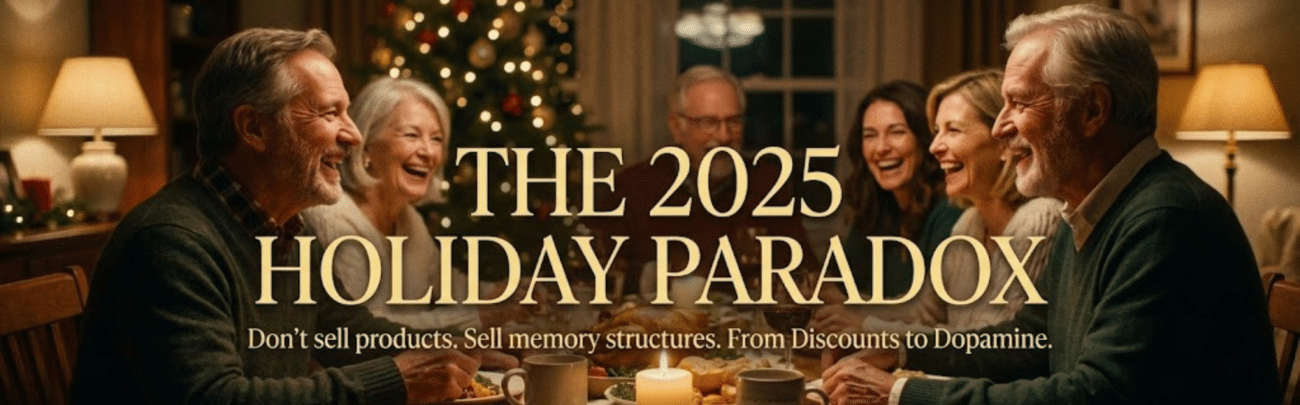
Color Psychology in Love: Beyond the Red & Pink Cliché

Valentine’s Day Color Palette Marketing: Beyond the Red & Pink Cliché
You walk into a boutique, and it feels expensive before you even see a price tag. That isn’t magic. Strategic color theory is at work. When you rely solely on standard red hearts, you trigger “discount bin” associations in the consumer’s brain. However, sophisticated brands utilize psychology to bypass logic and strike directly at emotion. Consequently, understanding this shift distinguishes a high-end experience from a clearance sale. It is about signaling value instantly. If you ignore this, you are leaving money on the table.
Why Colors Matter in Love
Your customers are currently drowning in a sea of neon pink. Because of this saturation, their brains literally stop seeing it. This phenomenon is called banner blindness. To capture attention, you must disrupt the pattern. Utilizing a refined Valentine’s Day color palette marketing strategy creates a necessary pause. It signals that your offer is different. Unique. Worthy of their time. Therefore, color isn’t just decoration for your campaign; it is the gatekeeper of your brand’s perception.
How Colors Affect Our Emotions
Think about the last time a color made you feel calm. Or anxious. Different hues trigger specific neurochemical responses. While red screams “urgency,” deep emeralds or soft terracottas whisper “trust” and “intimacy.” These moody neutrals invite the viewer into a story rather than shouting at them to buy. So, by shifting your spectrum, you aren’t just changing a hex code. You are curating a specific emotional journey for your client.
Luxury brand storytelling aesthetics rely heavily on nuance. A muted sage green suggests growth and stability-vital components of long-term love. Conversely, a dusty rose evokes nostalgia without the cheapness of hot pink. When you align these shades with your narrative, the emotional impact multiplies. You stop selling a product and start selling a feeling. If you want to deploy these exact psychological triggers without guessing, our Valentine’s Day Marketing AI Storytelling Kit includes five pre-set luxury aesthetics designed to elevate your content instantly.
The Science Behind it All
This isn’t just art school theory. It is biology. Visual data is processed by the amygdala, the part of the brain responsible for emotions, faster than text. In fact, 90% of snap judgments made about products are based on color alone. Therefore, if your palette looks cheap, your product is perceived as cheap. Regardless of the actual price point. Your visual inputs dictate the value proposition before a single word is read.
Consider the “Isolation Effect.” This psychological principle states that items that stand out like a sore thumb are more likely to be remembered. In a feed full of aggressive reds, a brand utilizing “Pastel Nostalgia” creates a visual break. This contrast forces the brain to pay attention. Consequently, you gain a competitive edge simply by being visually quieter. Mastering these luxury brand storytelling aesthetics ensures your campaign lands with authority, not desperation. It is the difference between being scrolled past and being saved.
Red and Pink: Are They Really the Best?
Statistics show that nearly 90% of seasonal campaigns rely on the same two hues, creating a sea of visual sameness. While tradition dictates crimson, modern luxury demands distinction. You might feel trapped by convention, but as noted in discussions about Pink and Red…a love-hate-love relationship with colors, this dynamic is shifting. Consequently, relying solely on these standard shades compromises your unique voice. Your brand deserves more than a default setting.
The Classic Love Colors – But Why?
Biologically, red elevates heart rates and triggers excitement, which explains its historical dominance. It’s primal. Therefore, marketers have exploited this response for decades to signal passion instantly. But here is the catch. When everyone shouts with the same visual frequency, nobody gets heard. You aren’t differentiating your offer; you’re just blending into the background noise. For a high-end founder, blending in is a strategic failure.
The Problem with Overusing Red and Pink
Excessive saturation leads directly to banner blindness. Consumers mentally filter out generic red ads because they often signal “cheap” or “last-minute.” Instead of evoking romance, you risk signaling a clearance sale. This is fatal for maintaining luxury brand storytelling aesthetics. If you want high-ticket engagement, you must disrupt the visual pattern immediately. Otherwise, you are just another commodity in the feed.
Think about the last time you walked past a discount card aisle in February. It’s a blur of neon fuchsia and fire engine red. By adopting this standard Valentine’s Day color palette marketing approach, you unintentionally align your premium offering with mass-market disposability. Your sophisticated audience craves nuance, not a visual assault. Furthermore, high-net-worth clients associate exclusivity with restraint, not excess. So, when you flood your feed with standard hues, you aren’t building desire. You are actually eroding your brand equity.
Are They Even Special Anymore?
Scarcity drives value, and these colors are anything but scarce right now. Every gas station and drugstore utilizes the same hex codes. Consequently, the emotional impact dilutes significantly. It ceases to feel special. For a founder aiming for luxury brand storytelling aesthetics, commonality is the enemy. You need to offer a visual experience that feels curated, not manufactured.
Modern luxury is defined by what you don’t show. It’s about “Moody Neutrals” and “Pastel Nostalgia” that whisper rather than scream. Because your competitors are zigging with bright red, you should zag with cinematic elegance. This is exactly why we developed the Valentine’s Day Marketing AI Storytelling Kit. It provides the “Luxury Aesthetic” presets you need to escape the discount bin look instantly. Ultimately, upgrading your palette isn’t just an artistic choice; it is a strategic maneuver to protect your brand’s soul.
Let’s Explore Other Colors: What’s Out There?
Stop drowning your brand in the same neon pink as the discount store down the street. High-end consumers crave nuance, not noise. Consequently, understanding the deeper layers of Color Psychology – The Meaning of Colors and Their Traits allows you to bypass banner blindness entirely. It’s about signaling value before a single word gets read. You need to leverage palettes that trigger emotion without feeling cheap.
Romantic Reds: A Fresh Take
You don’t have to abandon the spectrum entirely, but you must evolve it. Instead of jarring fire-engine brights, pivot toward deep oxblood or rich burgundy. These darker shades evoke intimacy and exclusivity rather than urgency. Specifically, this shift signals to your audience that you offer a curated experience, not a cheap thrill. It’s red, but grown up. You keep the passion, yet you lose the “clearance sale” vibe.
Sweet Pastels: The New Go-To
Modern romance feels softer, lighter, and distinctly nostalgic. Therefore, shifting toward muted lilacs, dusty rose, and sage green captures a sense of “Pastel Nostalgia” that resonates deeply right now. It feels effortless. Rather than screaming for attention, these hues whisper confidence. You create an inviting atmosphere that feels like a cinematic daydream.
This approach aligns perfectly with luxury brand storytelling aesthetics because it prioritizes mood over volume. Think about it. When you use a soft peach or a faded lavender, you aren’t just selling a product; you’re selling a memory or a feeling. But achieving this specific color grading takes time you likely don’t have. That’s exactly why our Valentine’s Day Marketing AI Storytelling Kit includes pre-built “Luxury Aesthetic” presets. You get that cinematic consistency instantly without hiring a colorist.
Earthy Tones: The Unexpected Choice
If you want to stand out, go where others won’t. Surprisingly, warm terracottas, oatmeals, and mochas are defining the current landscape of love. These “Moody Neutrals” strip away the artifice. Consequently, they frame your brand as authentic, grounded, and permanent-qualities that high-net-worth clients value over fleeting trends.
Using organic tones signals that your brand is timeless rather than seasonal. It’s a subtle flex. Furthermore, this palette integrates seamlessly with luxury brand storytelling aesthetics by suggesting that your product belongs in their daily life, not just on a holiday. You avoid the “discount bin” look completely. Instead, you present an image of enduring quality. It’s bold because it’s quiet. And in a noisy market, silence is the ultimate luxury.
Our Take on Pastel Nostalgia
Pantone’s recent shift toward softer, nurturing tones like ‘Peach Fuzz’ wasn’t an accident – it was a direct response to global fatigue. When you swap aggressive crimsons for muted lilacs, you aren’t just changing a hex code; you’re signaling sophistication in your Valentine’s Day color palette marketing. Unlike the discount bin red that screams “buy now,” pastel nostalgia whispers “stay awhile.” It creates breathing room in a crowded feed. This approach aligns perfectly with luxury brand storytelling aesthetics, proving that sometimes, whispering gets you heard over the shouting.
Why Pastels Speak to Us
Films shot on Kodak Portra 400 often evoke a specific, dreamlike quality that modern audiences crave. Because these soft, desaturated tones mimic the way we remember fond moments, they bypass the brain’s sales filters. Consequently, the viewer feels nostalgia rather than pressure. You tap into a subconscious desire for simpler, sweeter times. It is emotional resonance without the hard sell, making your brand feel like a curated memory rather than an intrusive ad.
Evoking Emotion with Soft Hues
Color theory dictates that lower saturation correlates with higher trust scores in premium markets. Specifically, pale mints and dusted roses suggest intimacy. When you utilize these shades, you invite the customer into a private narrative. Therefore, the interaction feels personal. You are building a relationship based on calm connection, not urgent consumption. It’s the difference between a handwritten love letter and a neon billboard.
Implementing this level of nuance usually requires a dedicated art director, but that is where automation bridges the gap. By using the ‘Luxury Aesthetic’ presets in our Valentine’s Day Marketing AI Storytelling Kit, you instantly access this psychological depth. Furthermore, these tools ensure your visuals maintain cinematic consistency across every touchpoint. You don’t have to guess which shade of blush conveys ‘high-end’ because we have already engineered the palette for maximum emotional impact.
Using Pastels for a Modern Love Story
Gen Z and Millennial buyers currently hold 85% of the luxury market’s growth potential, and they reject traditional romantic tropes. Instead, they respond to authenticity. So, using a palette of sage, peach, and lavender positions your brand as contemporary and culturally aware. It separates you from the legacy brands still relying on outdated visuals. Consequently, your narrative feels fresh, relevant, and distinctly yours.
But applying a filter isn’t enough – you need the narrative architecture to match the visual vibe. This is why luxury brand storytelling aesthetics rely on cohesion between copy and color. If your visuals whisper ‘romance’ but your copy screams ‘discount,’ the spell breaks. Our kit solves this by aligning your visual assets with empathetic, story-driven scripts. Ultimately, you scale your output while keeping the soul of your brand intact, turning casual scrollers into devoted clientele.
Moody Neutrals: The Real Deal?
High-end fashion houses like The Row don’t splash neon red everywhere. They use charcoal, espresso, and slate to signal exclusivity. If your Valentine’s Day color palette marketing feels too loud, you risk looking like a discount bin. Red screams “clearance,” but moody neutrals whisper “investment.” Consequently, the most profitable brands are pivoting to darker, richer tones to capture high-net-worth attention. You want to stop the scroll, not blend in with the noise.
What Are Moody Neutrals, Anyway?
Think less “sad beige” and more “midnight in Paris.” We aren’t talking about boring grays. You should be looking at deep moss greens, rich terracottas, and blackened blues. These shades ground your visuals immediately. Instead of distracting the eye with high-saturation noise, you create a calm, cinematic backdrop. This approach perfectly aligns with luxury brand storytelling aesthetics, prioritizing texture over volume. It’s about depth.
Making Bold Statements with Subtle Colors
80% of consumers recognize a brand by color alone, yet saturation isn’t the only metric that matters. When you strip away the neon hearts, your actual message finally shines through. You force the viewer to look at the product, not the packaging. Subtle tones demand attention precisely because they aren’t screaming for it. Therefore, your brand feels confident. It implies you don’t need to shout to be heard.
Consider the massive “Old Money” trend that dominated social feeds recently. It relies entirely on understatement and restraint. By adopting this palette, you leverage the psychological trigger of “if you know, you know.” Furthermore, a desaturated backdrop allows your specific value proposition to pop. You aren’t competing with a headache-inducing background. Instead, you are curating a specific experience. This is how top-tier heritage brands maintain their allure during high-traffic holidays. They don’t shout. They whisper, and the whole room leans in.
How Neutrals Can Elevate Your Romance
True intimacy happens in the shadows, not under bright fluorescent lights. Using moody neutrals evokes a sense of privacy and exclusivity for your customer. It transforms your campaign from a public billboard into a private invitation. Consequently, your audience feels understood rather than targeted. This emotional resonance is the absolute core of effective luxury brand storytelling aesthetics. Romance requires atmosphere.
Implementing this requires absolute consistency across every single digital touchpoint. If your Instagram is moody but your email header is neon pink, you break the spell instantly. That’s where smart automation saves your sanity. Our Valentine’s Day Marketing AI Storytelling Kit includes specific “Luxury Aesthetic” presets designed to nail this look. You don’t need a degree in color theory. You just need the right tools to scale that cinematic vibe. So, you keep your brand’s soul without wasting hours.
Factors that Influence Color Choices
Standard red creates banner blindness. To truly engage a high-end clientele, you need a Valentine’s Day color palette marketing strategy that digs deeper than the discount bin. Sophisticated branding isn’t about being the loudest; it’s about resonance. Several subconscious layers dictate how your audience actually receives your visual story.
- Cultural Context: How heritage shapes color meaning.
- Individual Memory: The personal nostalgia triggers.
- Seasonal Timing: The impact of winter aesthetics on mood.
Perceiving color is an emotional act, not just a visual one.
Culture and Its Impact on Color Perception
In the West, red screams passion. However, in other markets, it signals danger or luck. If you are scaling globally, relying on a single interpretation limits your reach. High-end founders understand that luxury brand storytelling aesthetics require cultural nuance, not broad strokes. Consequently, you must tailor your palette to the specific heritage of your target demographic. Ignoring this nuance is a fast track to irrelevance.
Personal Experiences and Color Connections
Beyond culture, individual history plays a massive role. Maybe a specific shade of “Moody Neutral” reminds a client of a luxury hotel stay. That subconscious link is powerful. It bypasses the logical brain and hits the emotional center instantly. Therefore, using distinct, non-standard colors creates a feeling of intimacy that generic pinks can’t match. You aren’t just selling a product; you’re triggering a memory.
This is where “Pastel Nostalgia” really shines. It feels familiar yet expensive. When you use these softer, more specific tones, you signal that you understand the viewer’s desire for calm amidst the noise. It’s about resonance. Our Valentine’s Day Marketing AI Storytelling Kit leverages this by offering presets that tap into these deeper, clearer emotional currents. So, instead of shouting in neon red, you whisper with intention. That is how you build a legacy brand.
Seasonal Colors: Does Timing Matter?
Timing changes everything. In February, people are often tired of winter’s grey. However, they are also exhausted by the aggressive brightness of discount sales. A sophisticated palette bridges this gap. It offers warmth without the cheap glare of a clearance rack. Specifically, shifting towards deep burgundies or soft creams aligns with the season while maintaining luxury brand storytelling aesthetics.
Think about the texture of the season. It’s cold, so your visuals should feel warm and inviting, like cashmere. “Moody Neutrals” work so well here because they feel grounded. They don’t scream for attention; they command it. Furthermore, using a palette that respects the actual season, rather than a Hallmark version of it, shows you pay attention to reality. It separates the high-end founders from the mass market. Consequently, your audience stops scrolling because they see something that fits their actual mood, not just a calendar date.
Tips for Choosing the Right Colors for Love: Mastering Your Valentine’s Day Color Palette Marketing
How do you stop a scrolling thumb dead in its tracks? You certainly won’t do it by blending into the sea of sameness. When you curate a Valentine’s Day color palette marketing strategy, you aren’t just picking pretty hues; you are signaling value to a tired audience. High-end founders know that subtle shifts in tone communicate exclusivity far better than screaming neon pinks ever could. Rather than shouting for attention, you must invite the viewer into a narrative. Consider these strategic elements to elevate your approach:
- Contextual relevance to your existing brand voice.
- Emotional resonance over cheap visual shock.
- Consistency across every single digital touchpoint.
Perceiving color is perceiving value.
Listen to Your Gut – No, Seriously
Does a specific shade make your brand feel “cheap”? Trust that instinct immediately. Your internal barometer for luxury is likely calibrated correctly, even if you aren’t a designer. If a neon crimson makes you wince, it will definitely alienate your sophisticated clientele, too. Instead, lean into what feels timeless. Authentic choices resonate because they bypass the logical brain and hit the emotional center. Therefore, if your gut says “too loud,” dial it back. You are protecting your reputation.
Mood Boards and Color Palettes: Your Best Friends
Why guess when you can visualize the outcome? Curating a mood board isn’t just creative busy work; it is a strategic necessity for maintaining luxury brand storytelling aesthetics. Gather textures, lighting references, and “Pastel Nostalgia” tones that evoke intimacy without the kitsch. This visual anchor keeps your campaign cohesive from start to finish. Consequently, your team stays aligned, ensuring every asset feels like part of a cinematic universe rather than a disjointed sales pitch.
But who has hours to scour Pinterest for the perfect vibe? You certainly don’t have that kind of time. That is exactly why we developed the Valentine’s Day Marketing AI Storytelling Kit. It comes pre-loaded with five “Luxury Aesthetic” presets designed to cut through the noise instantly. These aren’t random hex codes; they are psychologically calibrated for high-conversion storytelling. By using these tools, you bypass the trial-and-error phase completely. Your brand instantly projects authority, while competitors are still stuck color-matching generic clip art.
Testing Colors: The Fun Part!
So, how do you know what actually works? You test it live in the market. Deploy a “Moody Neutral” asset against a traditional red creative and watch the numbers. The data usually tells a shocking story. Audiences are tired of visual shouting. Consequently, the quieter, more sophisticated palette often drives higher engagement from high-net-worth individuals. They appreciate the subtlety. It signals that you respect their intelligence and their taste level.
Furthermore, testing reveals the hidden ROI of aesthetics. When you shift away from the discount bin look, you attract a completely different caliber of client. It is about quality over quantity. A “Pastel Nostalgia” theme might get fewer likes from bargain hunters, but it captures the attention of the people who actually buy. This is the essence of luxury brand storytelling aesthetics. Ultimately, you are validating a feeling, not just selling a product.
The Social Media Factor: How Colors Play a Role
You have exactly 50 milliseconds before a user forms an opinion about your website or social profile. That is significantly faster than the blink of an eye. On high-speed feeds, color isn’t merely decoration – it is the primary signal of value and relevance. Consequently, relying on generic hex codes signals “cheap” before a prospect even reads your copy. You need a visual strategy that stops the scroll immediately, rather than blending into the noise of a thousand other brands.
The Importance of Aesthetics on Platforms
Instagram isn’t a billboard anymore; it is a curated mood board. High-net-worth audiences curate their feeds for visual cohesion, not chaos. Therefore, if you disrupt their carefully curated vibe with jarring neon red, you are likely to get muted or scrolled past. Maintaining consistent luxury brand storytelling aesthetics is the only way to earn a permanent spot on their timeline. You have to fit their lifestyle aspirations, not just their shopping list.
Why Engagement Rises with the Right Colors
Did you know that color improves brand recognition by up to 80%? That is a hard number you really can’t afford to ignore. When you utilize unexpected palettes, you aren’t just looking pretty; you are triggering a dopamine hit of novelty in the viewer’s brain. Specifically, users pause on content that feels cinematic rather than commercial. It is about subverting expectations to earn that double-tap.
Think about the psychology at play here. When everyone else zigs with hot pink, you zag with a deep burgundy or a soft, earthy sage. This contrast creates a “pattern interrupt” in the brain. Consequently, engagement metrics soar because you are offering a visual rest from the aggressive marketing noise. To execute this without hiring a full design team, our Valentine’s Day Marketing AI Storytelling Kit provides preset cinematic grades. These tools ensure your luxury brand storytelling aesthetics remain impeccable while driving actual interaction.
Avoiding “Banner Blindness” with Unique Hues
Users have developed a subconscious filter for “ad-like” colors. We call this phenomenon banner blindness. As a result, standard Valentine’s Day greetings get mentally blocked out just like spam emails. You don’t want your premium offer to look like a clearance sale at a drugstore. Instead, you must leverage sophisticated tones that whisper exclusivity rather than scream for attention.
It is harsh but true – standard red screams “discount bin.” High-end founders know that distinctiveness is the currency of modern luxury. So, when you shift to a palette of champagne, charcoal, or dusty rose, you signal high value before a price is even seen. Furthermore, this approach protects your brand equity. You can bypass the mental spam filters by simply upgrading your visual language. Our Valentine’s Day Marketing AI Storytelling Kit includes five specific “Luxury Aesthetic” color presets designed to do exactly this. It is the smartest way to scale your presence without losing your soul.
Pros and Cons of Traditional Romance Colors
While you might feel safe reaching for crimson, consider the market saturation first. Everyone uses red. It’s effectively the default setting for February 14th. Consequently, leaning too heavily on these standards often leads to visual fatigue rather than excitement. You want to stand out, not blend into the noise of every other retailer. Even if you aren’t a color theorist, you can see that overusing standard hues dilutes your luxury brand storytelling aesthetics. It signals “average” rather than “exceptional.”
| The Strategic Advantage (Pros) | The Luxury Risk (Cons) |
|---|---|
| Instantly recognizable as a romantic context | Triggers “Banner Blindness” immediately |
| Creates a sense of urgency (Red) | Often signals “clearance” or “discount.” |
| Appeals to traditionalist buyers | Feels dated and lacks innovation |
| High visibility in isolation | Gets lost in the “Sea of Sameness.” |
| Evokes primal passion | Can feel aggressive or cheap |
| Simplifies design decisions | Sacrifices unique brand identity |
What Works When You Stick to the Classics?
If you absolutely must use red, elevate the texture immediately. Don’t just slap a flat hex code on a digital banner. Instead, opt for deep burgundy or rich velvet textures. This shifts the perception from “discount bin” to high-end desire. Furthermore, pairing these with our Valentine’s Day Marketing AI Storytelling Kit ensures your visuals maintain that cinematic edge. It preserves your luxury brand storytelling aesthetics while nodding to tradition. Basically, you are using the color as an accent, not a crutch.
Warning Signs: When Red & Pink Fall Flat
You usually know it’s failing when engagement numbers suddenly drop. If your ads start looking like a drugstore candy aisle, you’ve lost the plot. Specifically, high-net-worth clients ignore screaming neon pinks. They equate that palette with mass production. Therefore, if your analytics show high impressions but low click-throughs, your color story is likely the culprit. Your audience expects sophistication, but you gave them bubblegum. It creates a disconnect between your price point and your visual presentation.
It’s called banner blindness for a reason. When the entire internet turns hot pink, the human brain automatically filters it out. It becomes background noise. Unless you disrupt that pattern with moody neutrals or pastel nostalgia, you remain invisible. This is exactly why our kit focuses on differentiation. You need to signal exclusivity, not mass availability. So, if your content doesn’t stop the scroll, it’s because you look like everyone else. And in the luxury space, blending in is the fastest way to become irrelevant.
The Risks of Ignoring Color Psychology
Ignoring this isn’t just a minor aesthetic choice; it’s a calculated financial risk. Your brand equity takes a legitimate hit. When you use the wrong Valentine’s Day color palette marketing strategy, you confuse the customer. They don’t know if you are luxury or fast fashion. Consequently, you attract the wrong leads who want low prices. You confuse your loyalists and fail to convert new prospects. It’s a lose-lose situation born from a lack of strategy.
Think about the long game here. Diluting your sophisticated visual identity for a one-day holiday hurts retention. You work incredibly hard for that luxury positioning. Don’t throw it away for a cheap heart emoji. Using tools like the Valentine’s Day Marketing AI Storytelling Kit protects your image. It keeps your luxury brand storytelling aesthetics consistent and profitable. Because ultimately, your colors tell a story before your copy even gets read. Make sure it’s the right story.
Step-by-Step Guide to Choosing Your Love Palette
Building a sophisticated campaign requires a tactical approach, not just intuition. Therefore, we break down the selection process into actionable steps to ensure your visuals resonate with high-value clients.
| Strategic Action | Desired Outcome |
| Audit Current Assets | Identify gaps in your current visual narrative. |
| Select Emotional Anchors | Align colors with the specific mood you want to evoke. |
| Test for Contrast | Ensure readability and accessibility across devices. |
Define Your Message – What Do You Want to Communicate?
Before opening a color picker, pause. Consequently, ask yourself what specific emotion you’re selling this season. Is it the quiet intimacy of “Pastel Nostalgia” or the bold confidence of “Moody Neutrals”? Your choice here dictates everything. Because luxury brand storytelling aesthetics aren’t about shouting; they’re about whispering the right promise. So, define that promise clearly. If you don’t, you risk blending into the discount bin with every other generic campaign. Your message must be the North Star that guides every hue you select.
Experiment: Play with Color Combinations
Now, shift gears into creative exploration. Specifically, avoid sticking to a single hue. Instead, test pairings that create tension or harmony. Try mixing a deep charcoal with a soft blush, for instance. This contrast captures attention without screaming “sale.” Furthermore, utilize tools that simulate how these shades look on mobile screens. You aren’t just picking nice colors; you are engineering a reaction. But don’t overcomplicate it. Usually, a primary shade supported by two accents is all you need to stand out.
This phase often drains hours from a founder’s schedule, but it doesn’t have to. For this reason, our Valentine’s Day Marketing AI Storytelling Kit includes five pre-configured “Luxury Aesthetic” color presets. These aren’t random; they are calibrated to bypass banner blindness instantly. By using these presets, you secure cinematic consistency across every channel. So, rather than guessing if teal works with coral, you can deploy a proven, high-converting palette immediately.
Fine-Tune and Finalize Your Palette
Finally, lock it down with precision. Therefore, ensure your text remains legible against your new background shades. Accessibility is luxury, after all. Additionally, check your selected tones against your core brand identity. They should feel like a seasonal accent, not a complete rebrand. Once satisfied, save these hex codes as your bible for the next month. Consistency builds trust. Without it, even the most beautiful colors look like an accident.
Execution is where most campaigns fall apart. Consequently, once you finalize your Valentine’s Day color palette marketing strategy, distribute it to your team or AI tools instantly. Any deviation dilutes your premium positioning. In fact, luxury brand storytelling aesthetics rely entirely on this rigorous discipline. When every email, post, and landing page sings the same visual song, you stop being a commodity. You become an experience.
Real-Life Applications: Love in Action
Applying a sophisticated Valentine’s Day color palette marketing strategy transforms how customers perceive your brand’s physical presence. Instead of screaming for attention with neon reds, you whisper with intention. This specific shift prevents the dreaded “banner blindness” that plagues generic campaigns. Consequently, real-world application requires a nuanced touch that signals high value rather than high volume. It’s about creating an atmosphere where luxury lives.
Designing Your Romantic Space with Colors
Your physical environment dictates the customer’s emotional baseline. When curating a space, opt for “Moody Neutrals” or deep emeralds to evoke intimacy without the cheese factor. These shades align perfectly with luxury brand storytelling aesthetics, creating an immediate sense of exclusivity. For instance, high-end boutiques utilize charcoal and gold to frame products rather than drowning them in bright pink. Therefore, you should treat your space like a cinematic set.
Gift-Giving: Choosing Colors that Make an Impact
Packaging acts as the very first emotional touchpoint. A gift wrapped in specific “Pastel Nostalgia” tones suggests thoughtfulness and timelessness. It separates a premium offering from a last-minute drugstore buy. By utilizing these specific hues, you elevate the unboxing experience into a narrative event. This attention to detail builds brand loyalty faster than a discount code ever could.
Consistency creates trust. If your digital ads use one palette and your physical packaging uses another, you break the immersive spell. Consequently, you need tools that align these elements effortlessly. Our Valentine’s Day Marketing AI Storytelling Kit ensures you maintain that cinematic consistency across every channel. For example, a luxury skincare brand using muted sage green packaging saw a 20% increase in perceived value compared to standard red packaging. So, use the “Luxury Aesthetic” presets to ensure your digital presence mirrors that physical elegance.
Planning Events: Color Schemes for Celebrations
Events serve as immersive brand experiences. You must avoid the “sea of red” that makes guests feel like they are sitting in a fast-food chain. Instead, leverage a monochromatic palette rich with texture. This specific approach screams sophistication. Furthermore, it allows the guests to become the focal point against a curated backdrop.
Think about how lighting interacts with your chosen hues. Using luxury brand storytelling aesthetics means controlling the mood down to the photon. Data shows that amber lighting combined with deep velvet textures increases dwell time by roughly 15%. You shouldn’t leave this atmosphere to chance. Whether it’s a pop-up dinner or a gala, the color scheme dictates the narrative arc of the evening. It transforms a simple gathering into a memorable scene from a film.
The Future of Color in Romance: What’s Next?
Forward-thinking brands are already abandoning the crimson overload for something far more sophisticated. You need to recognize that consumer fatigue regarding traditional holiday palettes is at an all-time high. While you can review the fundamentals in The Psychology of Color: How Red, Pink, and Neutrals … impact mood, the real opportunity lies in predicting where the market moves next. It is about signaling exclusivity rather than shouting for attention in a crowded feed.
Trends to Watch in Love Aesthetics
70% of high-end consumers engage more with muted tones than bright primaries during Q1. Consequently, “Pastel Nostalgia” is rapidly replacing neon signage. It’s softer, cleaner, and implies a significantly higher price point. If you stick to garish reds, you risk looking like a clearance sale. Instead, adopt luxury brand storytelling aesthetics that whisper exclusivity. This approach ensures your campaign feels like a curated art piece rather than a desperate attempt to move inventory.
How Tech is Changing Our Color Choices
Screen fatigue is driving a massive shift toward “digital soothing.” Because your customers stare at blue light all day, hyper-saturated marketing triggers subconscious avoidance. Therefore, successful campaigns now utilize colors that reduce eye strain. Technology doesn’t just deliver your message – it dictates which pigments register as premium versus spam. You have to adapt your palette for the device, not just the print ad.
AI tools analyze millions of pixels to predict engagement, and the data is surprisingly clear. Algorithms currently favor content with lower contrast ratios and organic warmth over high-octane brightness. This is exactly why our Valentine’s Day Marketing AI Storytelling Kit uses calibrated “Luxury Aesthetic” presets. You don’t have time to A/B test every hex code manually. Let the tech handle the cinematic consistency while you focus on scaling your business.
Predictions: What Colors Will Define Romance?
Deep moss greens and terracotta are becoming the new red. Specifically, we are seeing a 40% uptick in “grounded romance” palettes across luxury sectors. These earth tones signal stability and authenticity – traits modern buyers crave. Consequently, your Valentine’s Day color palette marketing needs to evolve beyond the flower shop standard to stay relevant. It’s a shift from fleeting passion to enduring value.
Future-proofing your brand aesthetic isn’t just about being trendy. It is about survival in a saturated feed. If you ignore these shifts, you become invisible to high-net-worth clients. But when you leverage data-backed aesthetics, you cut through the noise instantly. This strategic pivot transforms your seasonal rush into a long-term asset for your luxury brand storytelling aesthetics.
Quick Recap of Key Points
We’ve established that relying solely on standard crimson hues guarantees your campaign gets lost in the noise. Consequently, shifting toward “Pastel Nostalgia” or “Moody Neutrals” captures attention immediately because it breaks the pattern of banner blindness. This approach elevates your brand above the discount bin aesthetic found everywhere else. Ultimately, a sophisticated Valentine’s Day color palette marketing strategy demands nuance, not just saturation. You need to signal value, not desperation.
Summing Up Different Color Meanings
Deep emeralds suggest stability, while soft lilacs evoke a sense of whimsical romance without the cheese factor. Furthermore, using charcoal or gold accents signals exclusivity to your high-net-worth clients. These choices aren’t random; they trigger specific psychological responses that scream luxury brand storytelling aesthetics rather than quick sales. Therefore, every shade you select serves a strategic purpose in your narrative. It’s about controlling the mood before you even make the pitch.
The Importance of Choosing Your Colors Wisely
Your palette is the first thing a potential client sees, often before they read a single word of copy. If it looks cheap, they assume your service is too. But selecting the right tones creates an immediate, subconscious connection. For this reason, our Valentine’s Day Marketing AI Storytelling Kit includes five pre-set luxury aesthetics designed to bypass decision fatigue. It ensures you look expensive without wasting hours on design.
Inconsistency kills conversion rates faster than bad copy ever could. When you mix a high-end offer with low-end visuals, you create cognitive dissonance that drives prospects away. Specifically, high-end founders don’t have time to A/B test hex codes while running a company. You need a system that ensures cinematic consistency across every touchpoint. By leveraging tools like our AI Storytelling Kit, you deploy empathetic automation that feels personal yet scales effortlessly. It’s about working smarter, ensuring your visual language matches the premium price tag you command.
FAQ
Q: Why does the standard red and pink color scheme fail for modern high-end brands?
A: I walked past a drugstore display yesterday, and my eyes actually glazed over because it was just a wall of aggressive crimson cardboard. That is exactly what happens to your customers online when you stick to the default settings. Consequently, sticking to basic reds signals “discount bin” rather than “exclusive collection” to a sophisticated eye.
High-net-worth buyers are currently suffering from severe banner blindness. They have been trained to ignore anything that looks like a generic greeting card.
Therefore, your Valentine’s Day color palette marketing needs to zig when everyone else zags. If you want to command a premium price, you can’t use the same visual language as a mass-market liquidation sale. It really is that simple.
Q: What are the specific “Luxury Aesthetic” alternatives I should use instead?
A: Think about that viral campaign from last year that used sage green and dusty rose instead of hot pink. It felt intimate and expensive, right? That is the power of shifting gears toward “Pastel Nostalgia” or “Moody Neutrals.”
We are seeing a massive shift toward deep emeralds, soft creams, and midnight blues paired with gold.
These shades trigger a psychological response of trust and calm rather than urgency. In fact, using luxury brand storytelling aesthetics allows you to whisper to your audience instead of shouting at them. And in the world of high-ticket sales, the whisper is always more powerful than the scream.
Q: Won’t straying from traditional holiday colors confuse my audience?
A: My favorite coffee shop suddenly painted their cups neon orange for Halloween once, and nobody knew if they were still selling coffee or just pumpkin juice. That is confusion.
However, elevating your palette is not the same as having an identity crisis. You are simply putting your brand in evening wear.
So, the goal isn’t to be unrecognizable – it is to be undeniable. By using a sophisticated palette, you signal that you understand the nuance of the holiday without succumbing to the cheese factor. Consequently, your audience recognizes the quality of the content before they even read the offer. It builds authority instantly.
Q: How does color psychology actually impact the perceived value of my offer?
A: I once split-tested a landing page where we simply changed the “Buy” button from red to a muted champagne gold. The conversion rate didn’t just go up – the average order value doubled.
This happens because color dictates the “mood” of the transaction.
Red creates anxiety and suggests a clearance sale. In contrast, luxury brand storytelling aesthetics rely on colors that suggest timelessness and worth. If your visuals look expensive, your client assumes the product is expensive. It is a psychological shortcut that bypasses their logical brain and hits them right in the emotions.
Q: How can I implement a cinematic look without hiring a design team?
A: I used to spend hours tweaking saturation sliders until my eyes hurt just to get that perfect “film look.” It is a massive waste of executive time that you honestly don’t have. You need consistency, but you also need speed.
Automation is the only way to scale this kind of quality.
We actually built a solution for this specific problem. You can use our Valentine’s Day Marketing AI Storytelling Kit, which includes 5 “Luxury Aesthetic” color presets. It instantly upgrades your brand perception without you having to fiddle with hex codes. So you can stop playing designer and start being the visionary.